Responsive websites- sounds great! Now- what is it?!
The digital age is here to stay, and we must adapt and stay ahead of the curve. The growth of smartphones and tablets is increasing substantially every year. The web is evolving now more than ever, and staying up to date with trends is a must.
The world of technology has changed a lot over the past few years. (Okay, more than a lot when you really start to think about it). Now we are heading towards the so called “post-PC era” — thanks to all the smartphones, tablets and netbooks.
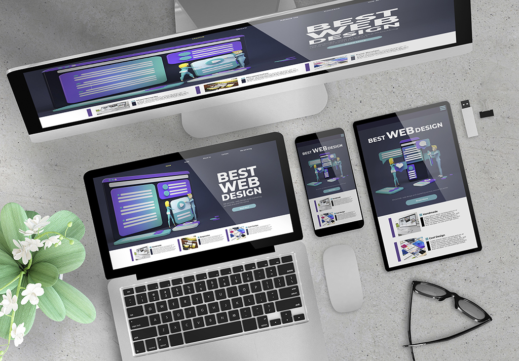
A site built using this technique will change formatting based on the size of browser they are viewed on. It includes scalable images and adjustable layouts, so as to look perfect no matter which device you are viewing the site from. In easier terms, it meets the challenge of multiple devices with varying screen size. Think of it as retrofitting for multiple screens. It is all done without the need for another mobile website that would need to be maintained separately.
To see this in action, try going to www.css-tricks.com in your desktop browser and slowly making the browser thinner and wider. You should see the layout adjust itself to fit more comfortably as you change the size. The website is programmed using responsive techniques.
Have you ever tried to go to a content-heavy site on your phone? Or go to a site on your phone and wish you didn’t have to pinch and zoom in 5 different ways to just get the text?
People are no longer accessing the internet strictly from a desktop computer. Creating a responsive design ensures that everyone viewing your site has a pleasant experience.
Your audience is on the go whether you’re ready or not. Are you ready to take your site to the next step? Let wisnet help prepare your site to go from full screen to mobile!